The majority of your website visitors are not ready to buy from you. That’s especially true if you attract organic visitors with your content.
If you want to hit a home run and close a sale, you need a process. So, let’s focus on the second base—using a newsletter signup form to collect email addresses.
After reading this article you’ll know:
- What newsletter signup is
- How to create newsletter signup and set it up
- How to get a newsletter signup sheet template for events
- 9 best tricks to increase your mailing list signup rates
- Some of the best newsletter signup form examples
- How to design effective signups
Ready to start?
Oh, by the way—
Let’s begin by explaining the newsletter signup definition.
What is newsletter signup?
Newsletter signup is a process of collecting email addresses from website visitors. Once they subscribe and join a mailing list, they can receive newsletter emails. It is one of the most popular lead generation techniques.
To create a newsletter signup flow it’s best to use a marketing automation platform. This way you won’t have to worry about connecting different tools and apps.
You can prepare a complete newsletter signup process in Tidio in 3 easy steps:
- Create a free Tidio account
- Integrate Tidio with your website
- Add the Subscribe Form template
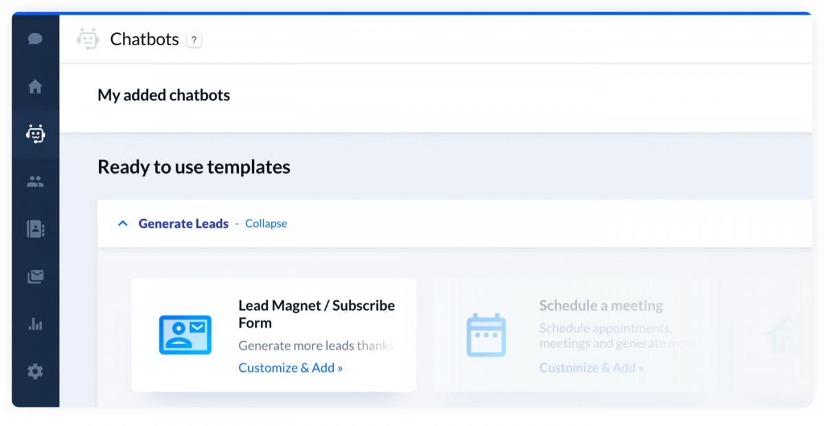
That’s all! New leads will be added to your Contacts. You can also import your existing customers to the app.
Do you know what is the best part?
You’ll be able to send you newsletters with Tidio too. There are 100+ email newsletter templates that you can access for free.
How do I create a newsletter signup form in WordPress?
The easiest way to create a chatbot-based newsletter signup process is to get Tidio. You can download and install the plugin with your WP-admin dashboard. You can also try a different signup form plugin for WordPress and integrate it with Form Abandonment chatbots available in Tidio.
Here is a more detailed description of the three steps.
1. Create an account
Tidio is free and you can use it to create survey or chatbot-based mailing list signups. To join 300,000+ users who already generate leads with Tidio visit the registration page and sign up.
During the tour, you’ll be asked to configure the look of your live chat widget. The widget will be one of the central elements of your newsletter subscription flow.
2. Integrate it with your website
There are several ways to integrate your account with your website. Here are the three most popular options:
- WordPress newsletter signup plugin. Search for the Tidio plugin in your WordPress admin panel.
- Shopify newsletter signup plugin. Integrate the Shopify plugin with your store.
- Manual integration. Copy/paste one line of code to integrate the app with any website.
Once the integration is complete, log in with the account that you created in the previous step.
3. Create newsletter signup with a signup form template
Once the widget is live on your website, you can navigate to the Chatbots panel. The Subscribe Form template is listed as one of the Generate Leads templates.

By default this flow is conversational. It means that the chatbot asks questions and saves the answers as custom properties. Alternatively, you can use a pre-chat survey to get subscribers to your newsletter.
If you are interested in a more traditional form of getting more email subscribers, you can collect them in person. You’d be surprised by the number of leads you can get in-person at various events.
Here is a newsletter signup sheet template that you can download for free:
Here is a newsletter signup sheet template that you can download for free.
However, we highly recommend going online to cast a wider net.
You can automate your whole email subscription process with Tidio. It has advanced email features and allows you to track how many subscribers open your newsletters.
But let’s not get ahead of ourselves. We should focus on how to make customers subscribe to our newsletter first.
So—
How to create a newsletter signup that will get you thousands of subscribers? Read on to find out.
Signup or sign up?
1. Signup (or sign-up) can be used as a noun or adjective. For example, we can say a newsletter signup form. Or here is a well-designed newsletter signup.
1. Sign up is a phrasal verb. Somebody can sign up for a newsletter.
No two businesses are alike. To a large extent, you’ll need to experiment to find what works best in your specific situation. However, there are some general directions to follow and foolproof methods to increase mailing list your signup rates.
Here are the most universal rules for creating high-converting newsletter signups.
1. Use Free Lead Magnets and Offer Discounts
Offer a free incentive in your signups
Let’s assume that your content and products are great. But your visitors will not subscribe to your newsletter on their own still.
Why?
Well, it’s not one of the things that people do out of habit. Even if they are genuinely interested, they may be reluctant to leave contact details.
They need a little push. A small incentive. For example, an ebook, a discount, or a free sample. Marketing professionals call them lead magnets. They can skyrocket your email subscription rate in a matter of weeks.
Pretty much anything can become your lead magnet. As long as your customers find it attractive. Some of the most popular things you can offer are:
- Ebooks
- Reports
- Checklists
- Cheatsheets
- Templates
- Free software
- Video tutorials
- Access to gated content
2. Tweak Your Signup Copy and Focus on Benefits
There’s a nice little trick that you can use to test if you are sending the right message to your customers. Consider these two examples:
❌ Example 1: Join our newsletter today. We have a collection of more than 50 roast recipes for beef, pork, lamb, and more that you can try
Potential Lead: OK? Good for you?
✅ Example 2: Impress your family & friends with juicy and tender roast. Join our newsletter and get 50+ secret recipes handpicked by our top chefs
Potential Lead: OK. Shut up and take my email address.
Do you see the difference? Always try to put yourself in your website visitors’ shoes. If your copy makes you go “meh” or “but what’s in it for me?”, then you should give it another go.
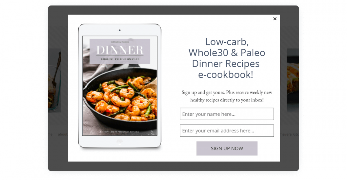
Focus on the benefits. What you offer should be of value to your users. If your newsletter is about fitness, you can stress how joining would help them stay healthy. Ultimately, people don’t want to exercise or be on a diet—they want to be in good shape.
3. A/B Test Your Newsletter Signup Forms
A/B tests allow you to display several versions of your website’s copy/design. For example, you can change CTAs inside your signup forms and see which will get more subscribers. If you have two variations, 50% of visitors will see the A variant, and 50% will see the B variant.
When the B version outperforms your control version, you can replace it (and it becomes your new A version).
A/B testing is a little bit like climbing. You get a firm hold with one hand and you try to find the next crack or wedge you can grab onto with the other. Then you repeat the process to move upwards.
There are many cool apps for A/B testing. Google Optimize is one of the best free solutions available. If you need advanced features and you intend to run many tests simultaneously, you can also try VWO.
If you collect emails with your chatbots, you can use A/B tests to send events and trigger different bots. Make your chatbots tag your contacts with custom properties. Afterward, you can compare how many times they were triggered and how many leads they collected.
4. Chatbots vs Pop-Ups as Mailing List Signup Forms
Newsletter signups take many shapes and forms. Pop-ups are the most common types but there are also many alternatives.
The most popular newsletter signups are:
- Pop-up signup form
- Sidebar signup form
- Modal signup form
- Chatbots
Modal signup forms take over the whole screen. Traditional pop-ups are less intrusive but visitors still tend to find them irritating.
Where do I put the newsletter signup form?
Some of the most popular positions for newsletter signup form placement are the right sidebar, the heading of a blog post, the footer. The most common strategy is to place it somewhere at the very top or at the very bottom of your page.
Sidebar forms are very common on blogs. They usually are displayed permanently and they follow you around as you scroll down.
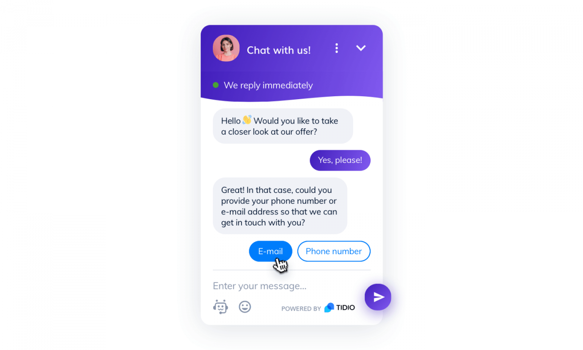
You may have noticed chatbots are the only type of newsletter signup that is not a form in the traditional sense of the word.
Chatbots offer the most natural way for users to subscribe.
Why?
Because the signup process can be interwoven into conversations and broken down. It is far less intimidating for users to answer one question at a time.
Read more: Check out the best pop-up advertising strategies you can use to get your visitors to convert.
5. Choose the Right Moment
Good marketing, like good comedy, is all about timing (and targeting the right audience). If you attack your website visitors with too many CTAs, they will get dizzy and bounce. It is very important to map how your visitors browse your website and pick the best moment to show signup forms.
Lead generation is less critical than sales. It means that your primary efforts should be directed towards making people buy from you. Signing up for your newsletter is of secondary importance.
Signing up for a mailing list should be the last action people take right before leaving. They will not subscribe to your blog if you immediately bomb them with pop-ups and don’t give them a chance to read it. Therefore, you should consider some form of delay.
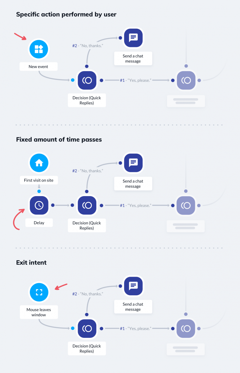
There are three ways of making your signups appear later than your primary CTAs. Your newsletter signup chatbots/forms can pop up when:
- Someone wants to leave a page (exit intent, the mouse pointer leaves a window)
- A specific action is performed (for example the scroll depth reaches a certain value or somebody hovers over an element)
- A fixed amount of time passes (for instance 30 seconds after opening a page)
In Tidio, you can use all three of these triggers to start your signup bots.
You can create advanced flows and add more conditions with marketing automation software.
6. Simplify Your Mailing List Signups
Your signup forms shouldn’t be too long. The more fields they have, the fewer subscribers you’ll get.
Consider keeping only the bare minimum. Email address, first name, and an agreement checkbox are enough. Even the first name is optional but, once you have it, it is easier to personalize your email campaigns.
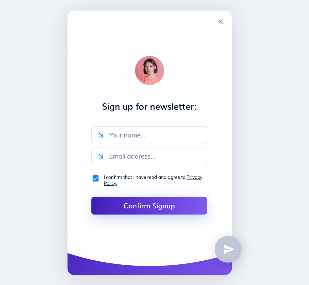
If you have to collect more data, ask some extra questions that appear after the signup is complete. This is very easy if you are using chatbots.
Read more: How to Create a Chatbot and Add It to a Website
7. Consider What Happens After the Signup
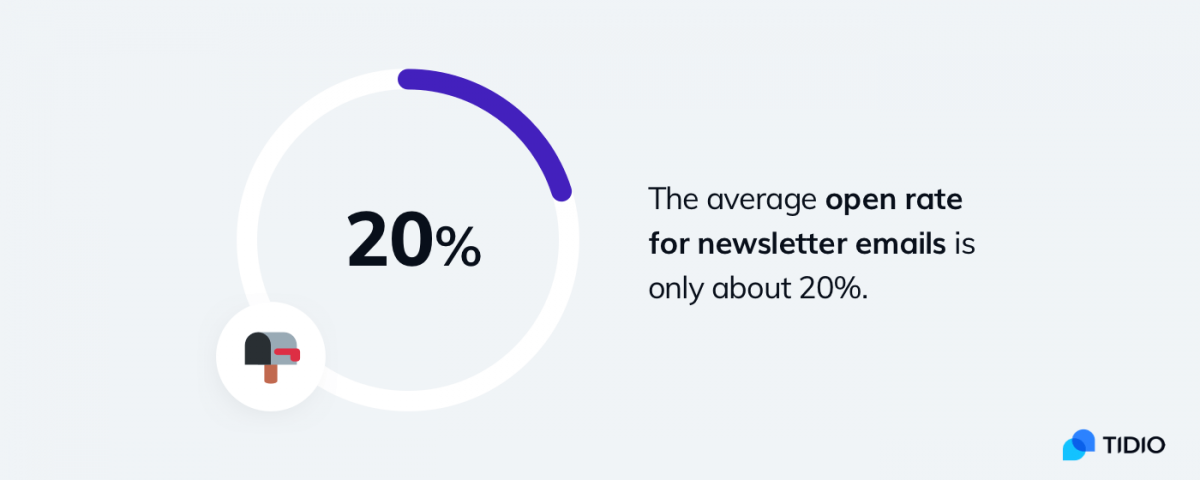
Getting people to sign up for your newsletter is only the first step. The average open rate for newsletter emails is only about 20%. Furthermore, a lot of your subscribers will remain inactive.
This may be counterintuitive but you need to strike the iron while it is hot. If somebody joins your newsletter, you should immediately send a welcome email.
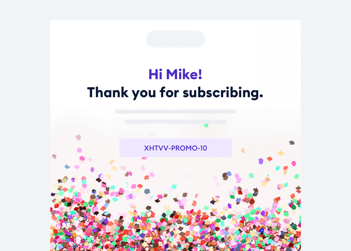
Welcome emails help to establish better relationships with your potential customers. And relationship marketing (link) should be an essential part of your customer acquisition strategy.
You can find out more about different emails that you can set up: Best Email Automation Examples
8. Leverage the Power of Great Visuals
A picture is worth a thousand words. Images provoke an instant response while words need to be “decoded.” If you want to draw someone’s attention it is crucial that you use visual cues to your advantage.
You should experiment with different visuals and see what works for your industry. There are some evergreens like smiling people but it may turn out that abstract designs will perform better in your niche.
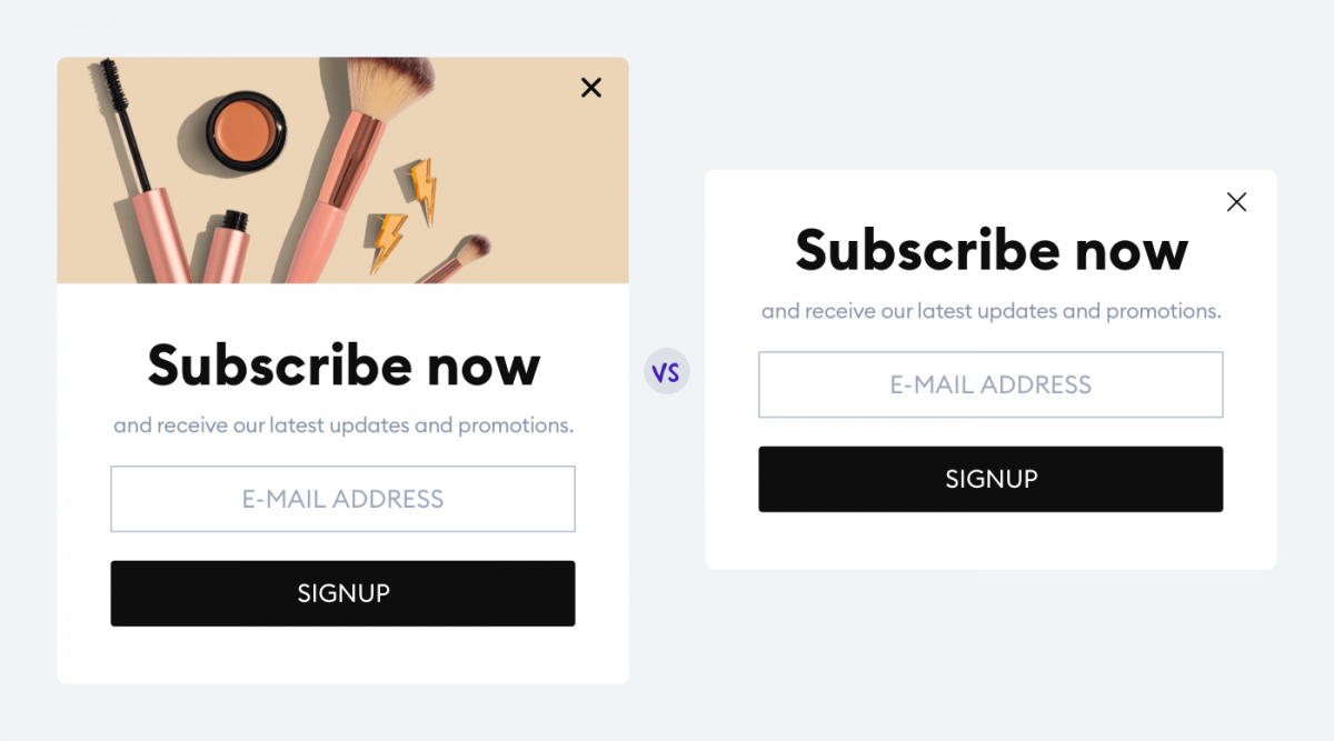
According to our research, visitors sign up for a newsletter more frequently if there are images in the first message. The newsletter signup form with a picture had 79% more interactions than the one with text alone.

If you have a lead magnet, you should make it the most important element of your newsletter signup form. Design it in a way that highlights what your visitors get for leaving their email addresses.
9. Use Social Proof
Most people believe that they are smarter than most people. But they also believe that the number of people who enjoy something is a good indicator of quality.
When a book becomes a bestseller it gets even more popularity and sales. It’s a snowball effect. Once you get past a certain threshold, you can get bigger and bigger faster and faster. The same rule applies to the world of online marketing.
If you want your website visitors to fill in your email newsletters signup, show them the numbers.
It is far easier to subscribe when you know that there are 1,000+ people in your niche who have done that already. And you can get your first 1,000 subscribers in a matter of several months with lead generation chatbots.
The rules for creating mailing list signup forms seem pretty straightforward. But theory and practice are two completely different things. Let’s take a look at some good newsletter signup examples.
Shopify Newsletter Signup That Uses Social Proof
Shopify has some great content about running an eCommerce business. If you are looking for ways to improve your Shopify marketing strategy, there is no better place.
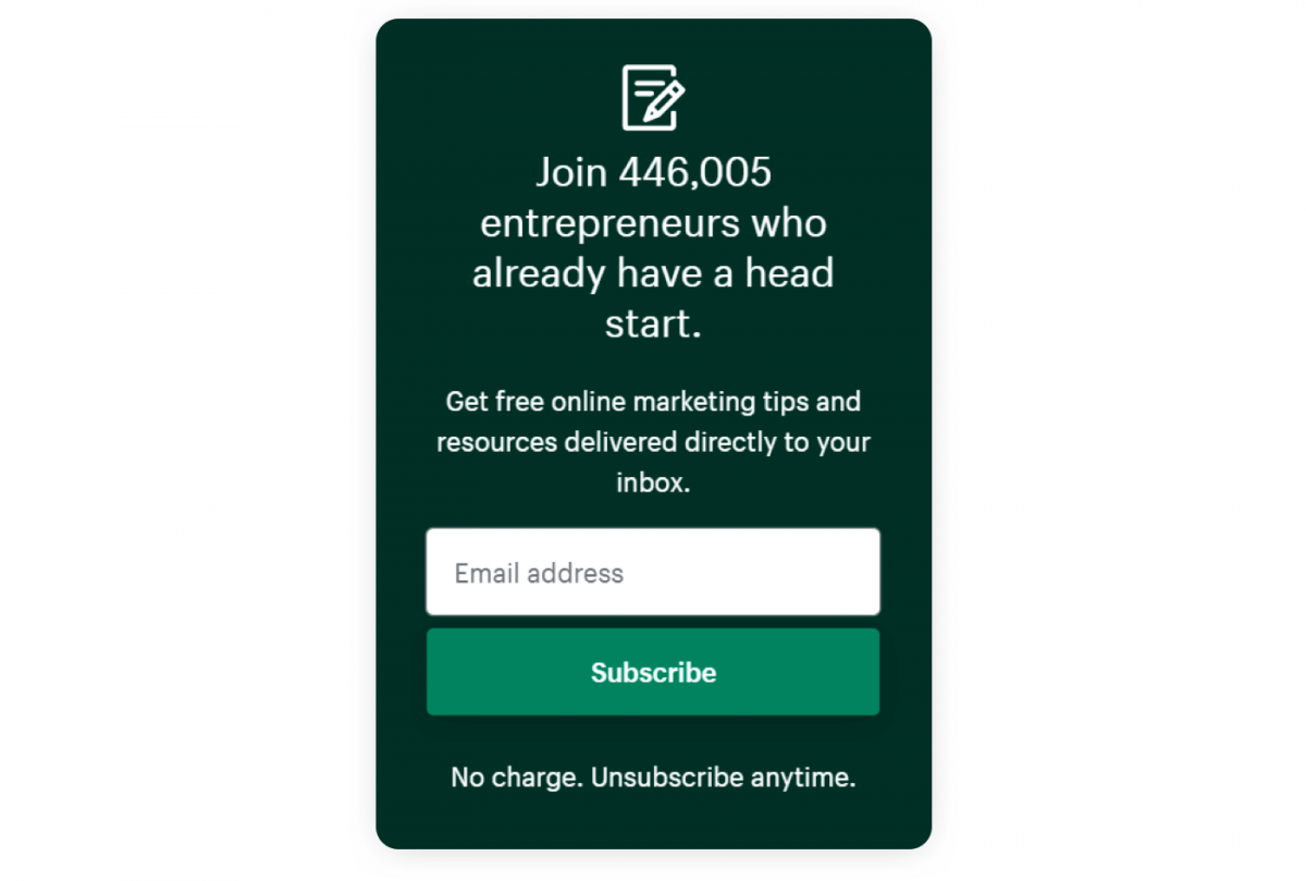
The number of Shopify users is very impressive. It stands to reason that their signup form should use social proof. They don’t need to offer additional lead magnets. Great tips and thousands of readers are enough to attract new newsletter subscribers.
Lumineux Mailing List Signup That Offers a Discount
Newsletter signups tend to be quite similar. However, the general pattern that you’ll notice is that online stores almost always throw in a discount. Their newsletters are not about quality content but product updates and special deals. Lumineux is no exception.
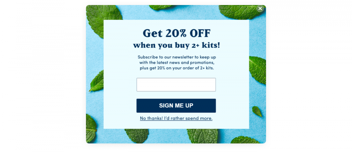
This newsletter signup has a nice twist in the copy as well. The “No thanks! I’d rather spend more” is a common alternative to the plain old “No” in the world of online marketing. You are making the customers less comfortable with turning down your offer.
New Yorker Minimalist Newsletter Signup Form
This newsletter signup form is as simple as it can get. There is only one field to fill in and it is self-explanatory. If you join the newsletter, you know exactly what to expect.
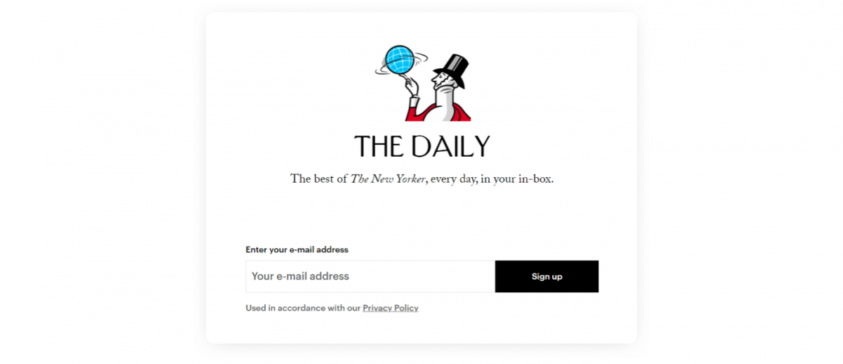
The design is minimalist and uses the character of Eustace Tilley—the iconic mascot/logo of the magazine. It’s elegant and fits the style of The New Yorker.
Nike Seasonal Newsletter Signup
This pop-up newsletter signup appears on the homepage of Nike. They dynamically change the copy for each country but it is linked with the holiday shopping season. It’s a good idea to update your newsletter signups from time to time to make them more relevant.
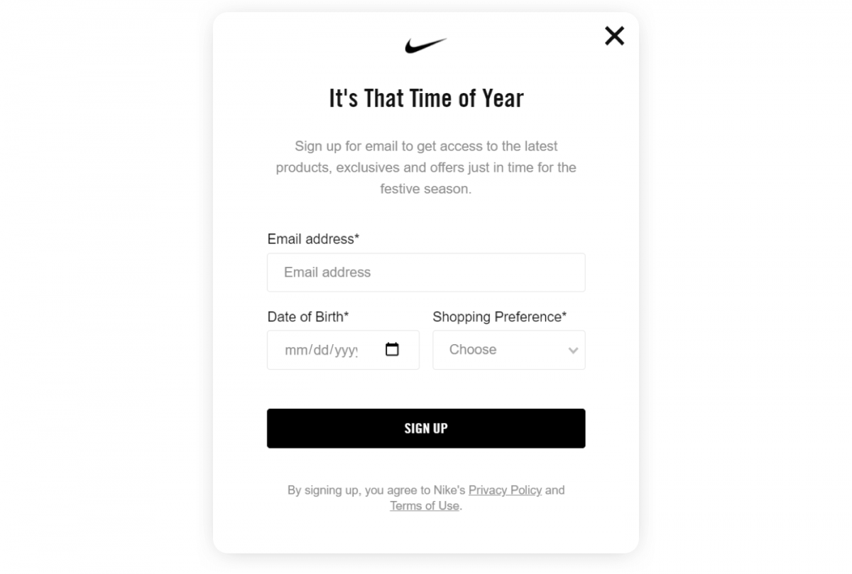
The number of fields is quite high but it will allow Nike to personalize their email marketing. Again, the main benefits that you get by subscribing are premium deals on products.
A Better Lemonade Stand Sidebar Signup Form
Here’s another sidebar newsletter subscription form. The form used by A Better Lemonade Stand is strikingly similar to the mailing list signup example from Shopify. Once more the power of social proof is employed to give more credibility to the blog.
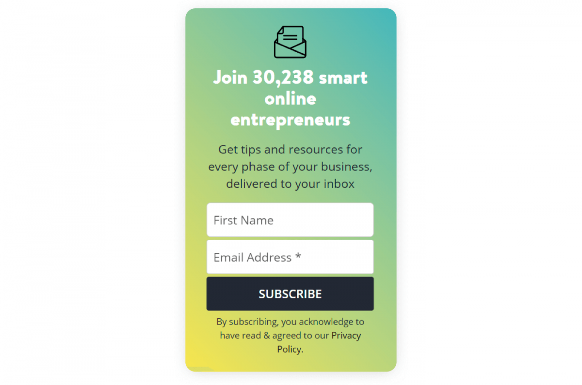
The copy is benefit-oriented and it uses some nice psychological hacks. For example, it implies that joining makes you a “smart” entrepreneur. Interestingly, the number of subscribers is not rounded. 30,238 does sound much more believable than 30,000, doesn’t it?
Your newsletter signup forms can help your business grow or scare your customers off. Take a look at these two examples of newsletter signups.
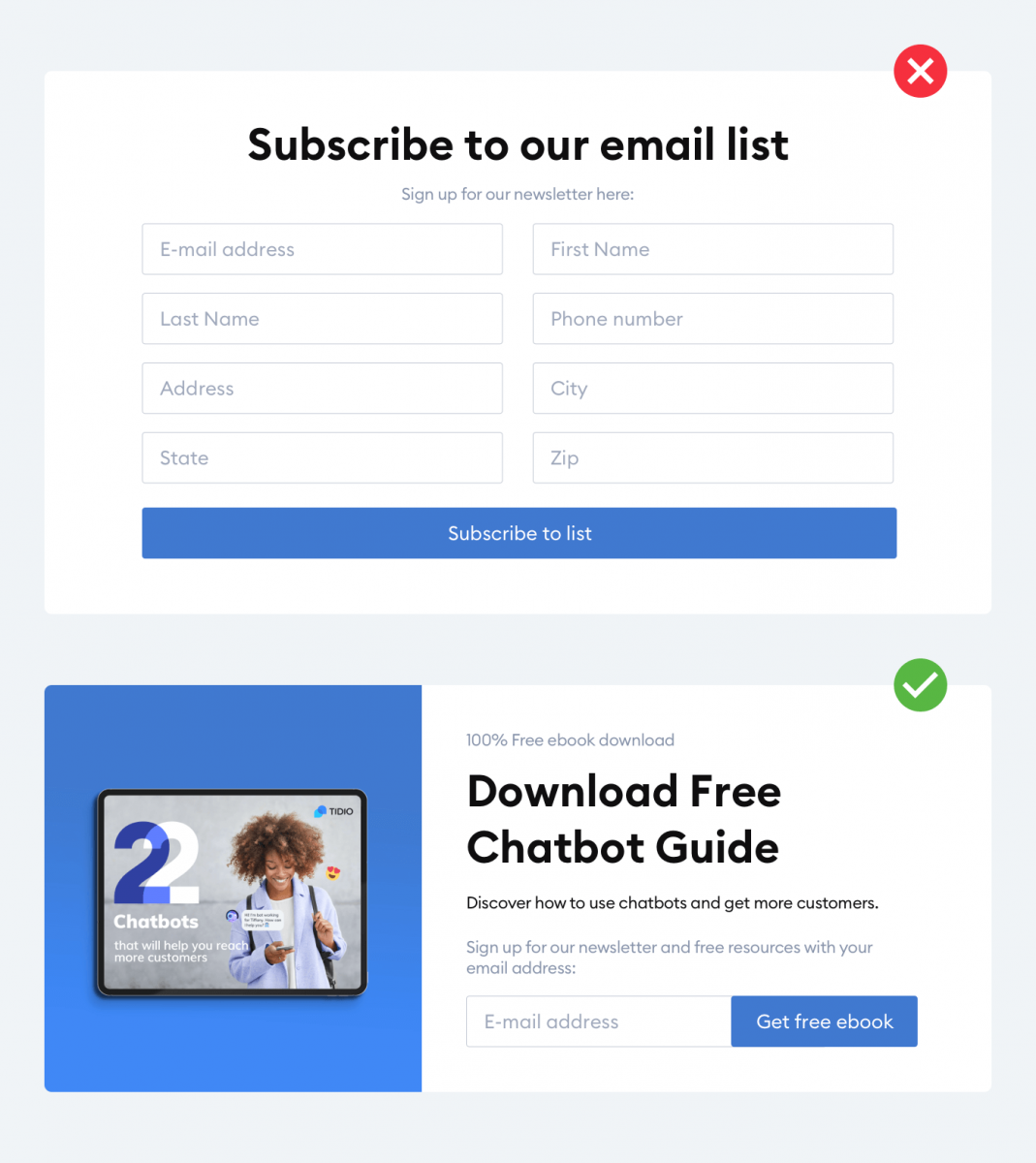
It should be quite obvious which one will encourage visitors to subscribe.
Key Takeway
Here what you should remember when designing and setting up your signups:
- Make your forms and newsletter signup chatbots stand out. They should be in the right place or visible even when visitors scroll your pages down. For, example a sidebar or a fixed widget in the corner of a page is a good option.
- Tell your customers what they will get for signing up. There is no point in being vague and mysterious. Your potential subscribers want to know what they are getting into.
- Avoid too many form fields and questions. Keep your mailing list signup forms simple and straightforward. The fewer steps, the better chance that someone will sign up for your newsletter.
- Make your copy full of benefits and use social proof. Join our newsletter is a clear and self-explanatory call to action. But Join 5,404 small business owners who have an unfair advantage sounds much more tempting.
- Try out different solutions, designs, and texts. There are many different ways to collect emails and newsletter signup strategies. A/B tests can help you to choose the best one. Try out traditional forms or spice up your lead generation with chatbot marketing.
Are you ready to set your newsletter and the signup flow right away? If yes, then try out the all-on-one free app and start growing your email list.

