Chatbot design combines elements of technology, user experience design, and good copywriting. It is also becoming a trending profession. The sheer number of chatbot conversation designer jobs listed on portals like LinkedIn is impressive. Last month there were 1,200+ chatbot designer job openings in the US alone.
The question is—
What does it take to build great chatbots?
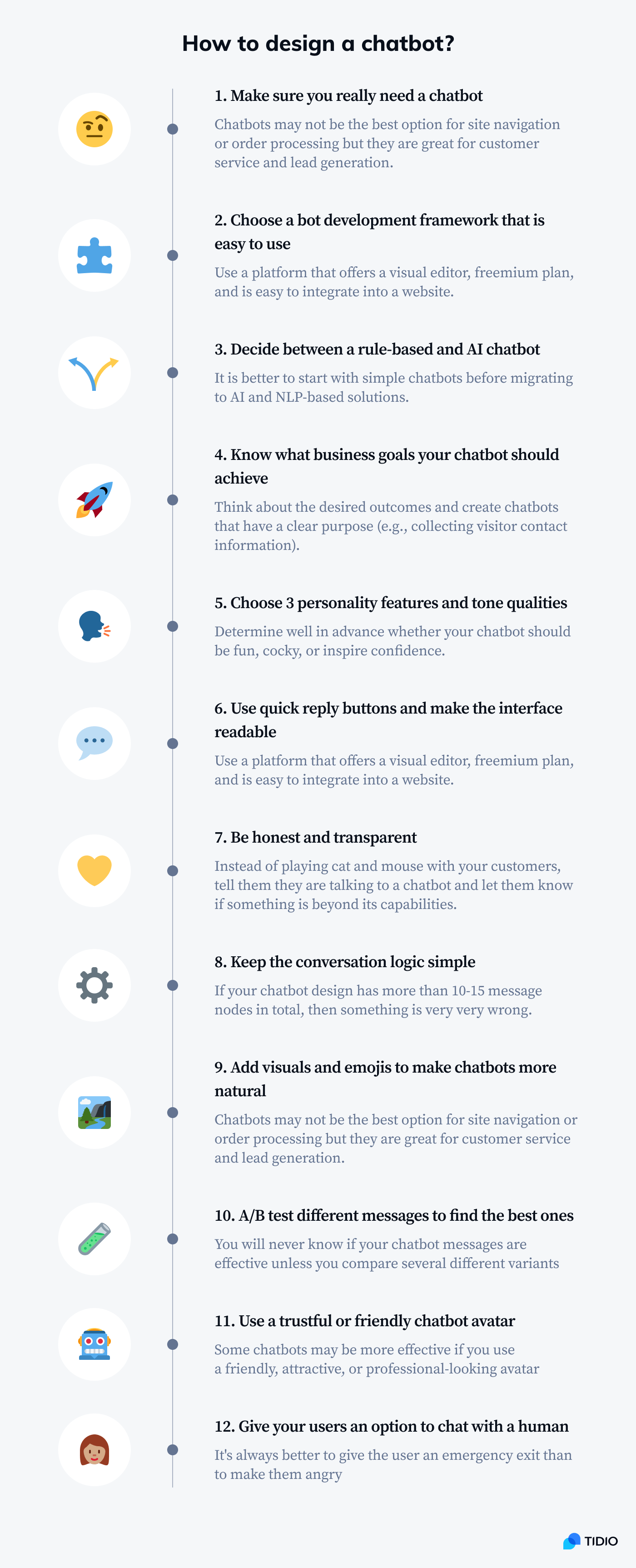
We’ve broken down the chatbot design process into 12 actionable tips. Follow the guidelines and master the art of bot design in no time.
Let’s go through chatbot design best practices one at a time, shall we?
Best Chatbot Design Principles
Designing chatbot personalities and figuring out how to achieve your business goals at the same time can be a daunting task. We’ve compiled a list of chatbot design guidelines. You can scroll down to find some cool tips from the best chatbot design experts.
If you want to learn how to design a chatbot conversation, you need to practice. But it is going to be much easier if you try to avoid some common chatbot design mistakes.
Things to avoid when designing your chatbots:
- Pretending to be human
- Pointless banter
- Messages that may appear rude
- Chatbot conversation scripts based only on NLP
- Typos and irritating grammar mistakes
- Messages that are too long
1. Make sure that what you need is a chatbot
Before you ask how to design a chatbot, you should ask yourself: Do I really need a chatbot for that?
The most important and often the hardest part of chatbot design is deciding if something should be a chatbot in the first place.
There are tasks that chatbots are suitable for—you’ll read about them soon. But there are also many situations where chatbots are an impractical gimmick at best.
In 2016 eBay introduced it’s ShopBot—a facebook messenger chatbot that was supposed to revolutionize online shopping. It seemed like a great idea and everyone was quite confident about the project.
Over a period of two years ShopBot managed to generate 37K likes… at a time when eBay had more than 180 million users. But people didn’t really feel comfortable with placing an order via a chatbot.
The mobile app turned out to be more intuitive and useful than the chatbot. If you think about it, it is way easier to browse through products via a mobile app than describe what you are looking for to a chatbot. It may feel like playing Twenty Questions!
Conversational interfaces were not built for navigating through countless product categories.
Chatbot design examples:
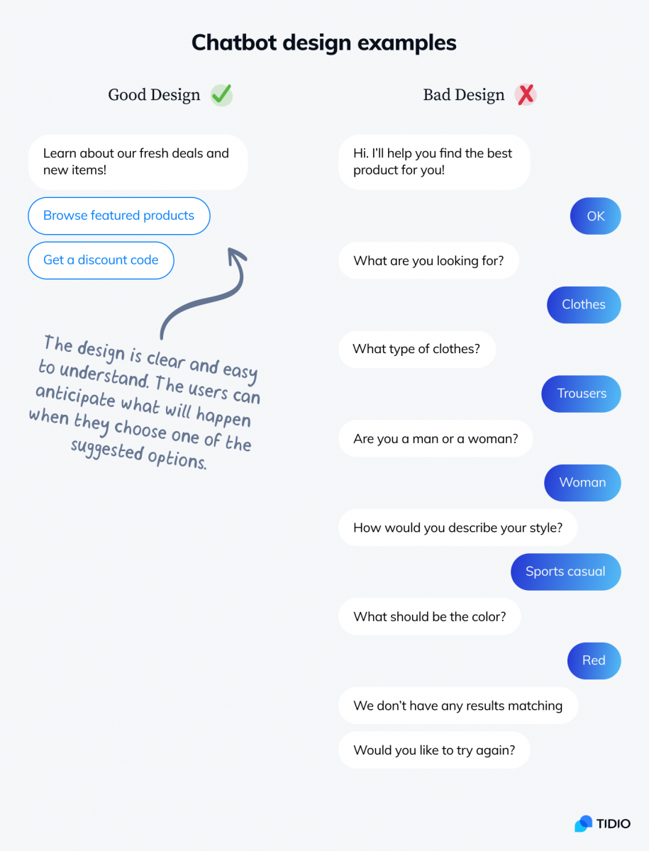
Chatbots can inform you about promotions or featured products. But if you sell many types of products, a regular search bar and product category pages may be better. Incorporating complex navigation into a chatbot interface is a bad idea.
Conversational Design
Conversational user interfaces like Alexa, Siri or Google Assistant offer real-time assistance. They are extremely versatile and use advanced AI algorithms to determine what their user needs.
Find out more about specific business cases for chatbots here.
2. Choose the right platform and framework
There are many chatbot platforms and tools available online. You can use the majority of them in your browser as web apps. All you need to do is create an account.
Still, there are many things that can go wrong with your website chatbot design. Some chatbots can:
- Look weird on mobile devices
- Work only on few selected channels
- Offer very limited personalization options
It may be a good idea to choose a platform that seamlessly integrates with your website or Facebook page.
For example, with Tidio you can:
- Add a chatbot on websites powered by WordPress or Shopify by installing a plugin
- Use chatbots on any website by inserting a single line of auto-generated code snippet
- Integrate chatbots with Facebook Messenger or other messaging apps
- Create a unique chatbot landing page with a customizable URL (you can just send a link to anyone and open it in any browser)
- Use triggers or JavaScript API to connect chatbots with any kind of events happening on a website
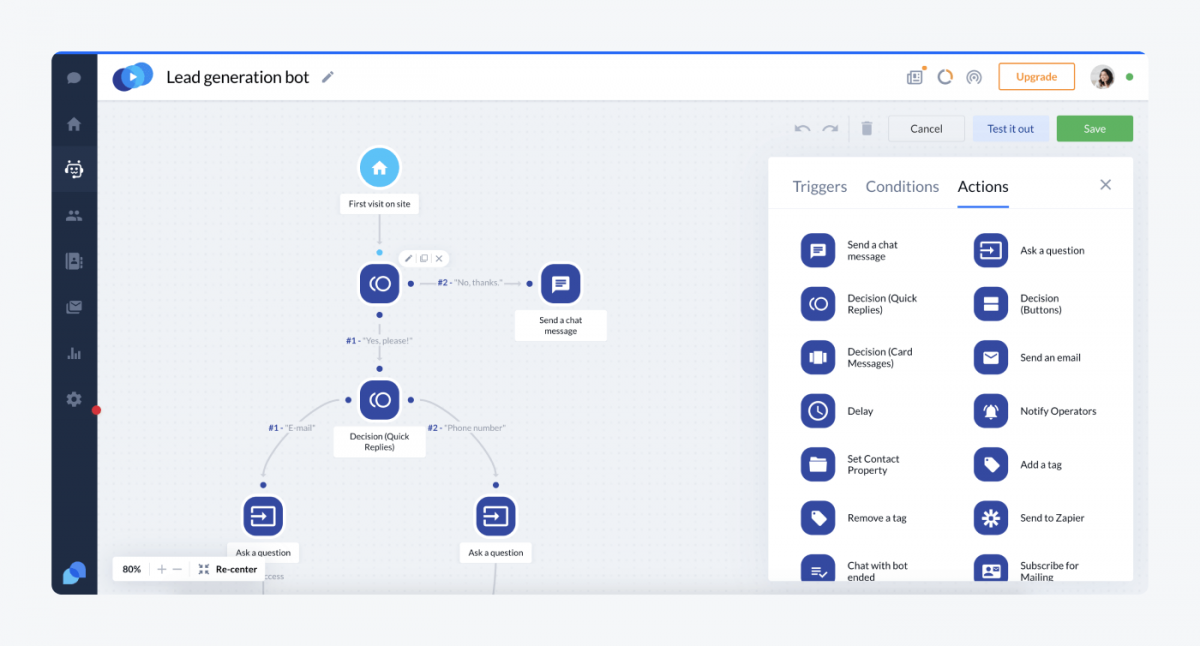
If you want to use free chatbot design tools, it has a very intuitive editor.
3. Determine if you need AI and NLP or a simple decision tree chatbot
This is another difficult decision and a common beginner mistake. Most rookie chatbot designers jump in at the deep end and overestimate the usefulness of artificial intelligence.
Conversational AI and Natural Language Processing are promising technologies. But—
Novice chatbot designers don’t take into account that machine learning works well only when we have lots of data to learn from. And you don’t have it when you are starting from scratch.
Chatbot design examples:
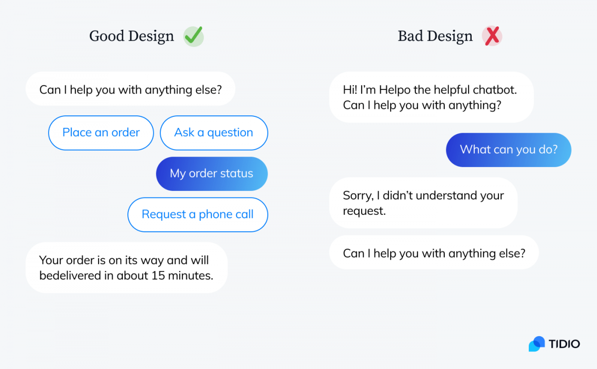
Some chatbot apps, like Tidio, offer both types of bots. But that doesn’t mean that you should choose AI chatbots just because they are “more advanced.”
Here is the best way to approach the problem of insufficient data for your AI:
- Phase 1: Use live chat and analyze conversation scripts to discover the most common customer queries and messages
- Phase 2: Build a decision tree chatbot that helps to solve the essential problems and collect more data
- Phase 3: Use the data to create an additional AI bot equipped with intent detection to handle other things customers ask about
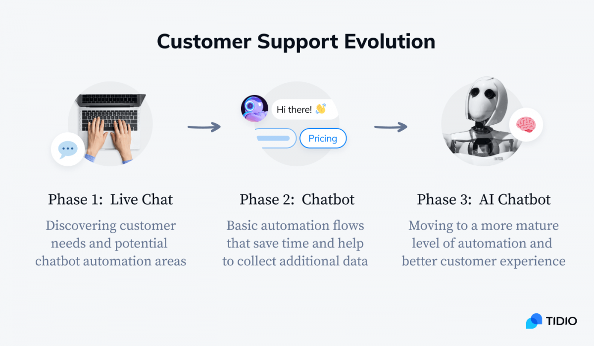
A clean and simple rule-based chatbot build—made of buttons and decision trees—is 100x better than an AI chatbot without training.
4. Set up goals and stick to them
A good chatbot is designed to perform one task at a time. That’s the way customers like them too. No one wants their chatbot to change the subject in the middle of a conversation.
It will tempt you to kill two or three birds with one stone. Sometimes it is possible but most of the time you should focus on one objective only.
One trick is to start with designing the outcomes of the chatbot before thinking of the questions it’ll ask.
Dr. Saksham Sharda
Chief Information Officer at Outgrow.co
Take a look at this example.
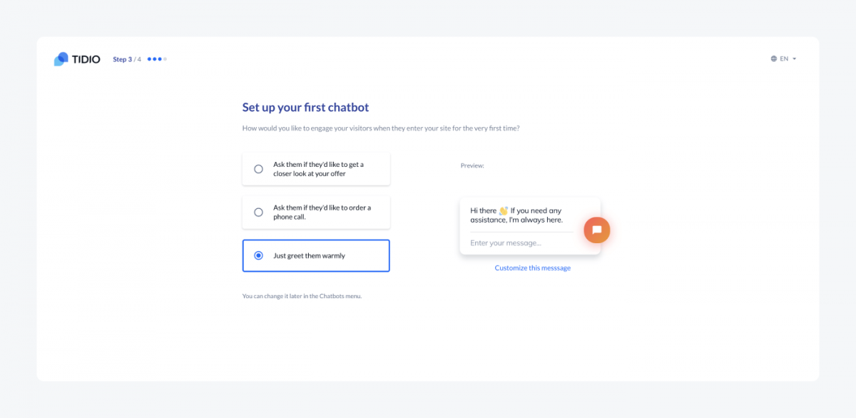
Here, you can design your first chatbot by selecting one of pre-configured goals. But you can’t eat the cookie and have the cookie (but there is an easy trick I’ll share with you in a moment).
The most popular chatbot goals are:
- Generating leads
- Showing featured products
- Booking meetings and demos
- Answering FAQs
- Rescuing abandoned shopping carts
- Collecting feedback
You can design complex chatbot workflows that will cover three or four of the aims mentioned above. However, it is better to use a dedicated chatbot for each and every goal.
For example, you can trigger a lead generation chatbot when somebody visits a specific page. Afterward, when the visitor scrolls down to the bottom of the page, another chatbot that collects reviews can pop up. This way you can combine several goals.
Chatbot design examples:
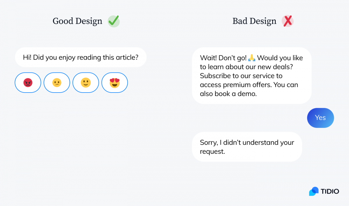
5. Consider the tone and voice
Most chatbots will not be able to accurately judge the emotions or intentions of their conversation partners.
Take a look at this poor, clueless bot:
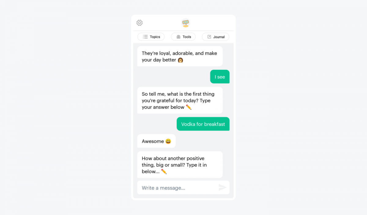
A real person would adjust their tone accordingly. However, a cheerful chatbot will most likely remain cheerful even when you tell it that your hamster just died.
If you want to hear the truth—
You don’t need to worry about it. A fixed tone is a good thing. You don’t need to always mimic human conversations.
With a chatbot that has a clear objective, it shouldn’t be an issue. Once you decide on a specific purpose, choose the appropriate message tone and chatbot personality. Some users won’t play along but you need to focus on your perfect user and their goals.
When designing your chatbot conversations, choose from the following tone qualities:
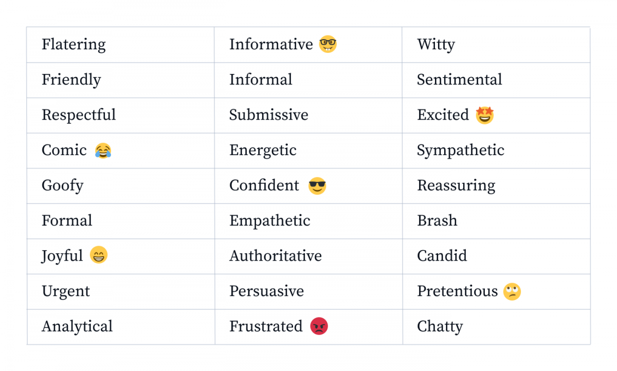
Are you designing a chatbot for a mental health website? It should probably be sympathetic, respectful, and friendly.
Maybe your chatbot is supposed to increase sales. OK. It should be persuasive, energetic, and spiced up with a dash of urgency.
Choose between 3-5 of the most desired characteristics. You can also select some of the ones to avoid. It will make your messages more interesting and consistent.
If you want to be sure you’re sticking to the right tone, you can also check your messages with dedicated apps. Here is a tone detector tool from Grammarly.
What’s the difference between tone and voice?
The tone is an expression of attitude in a given situation. Voice is linked with general character and personality. Find more about the differences here: Why Are Brand Voice and Brand Tone of Voice Important?
You should also think about your target users. The same chatbot can be perceived as helpful and knowledgeable by one group of users and as patronizing by another.
Great chatbot design always puts end users first. Consider criteria such as their:
- Age
- Gender
- Education
- Native language
- Technical skills
- Profession
- Health
6. See to it your chatbot UI is friendly and readable
Designing chatbot personalities is hard but allows you to be creative. On the other hand, nobody will talk to a chatbot that has an impractical UI.
It’s important to consider all the contexts in which people will talk to our chatbot. For example, it may turn out that your message input box will blend with the background of a website. Or messages will become unreadable if they are too dark or light and users decide to switch the color mode.
Poor UX example:
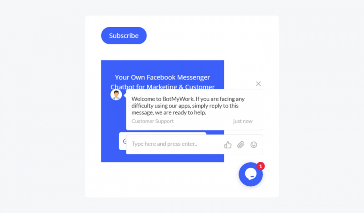
If you want your chatbot UI to work, make sure that:
- It is easy to read all messages and scroll up and down
- The chatbot widget does not interfere with other elements of a website
- It is easy to start the conversation again from the beginning
- It’s clear when to write and when to click a button or take other actions
- The conversation panel displays correctly on mobile devices
- The design follows the Web Content Accessibility Guidelines (WCAG)
Website chatbot design is no different from regular front-end development. But if you don’t want to design a chatbot UI in HTML and CSS, use an out-of-the-box chatbot solution. Most of the potential problems with UI will already be taken care of.

7. Tell your customers that they’re talking to a chatbot
Chatbots can’t pretend to be human for very long. The users see that something suspicious is going on right off the bat. If someone discovers they are talking to a robot only after some time, it becomes all the more frustrating.
The best policy?
Say it right at the very beginning of the conversation. For example, in your welcome message.
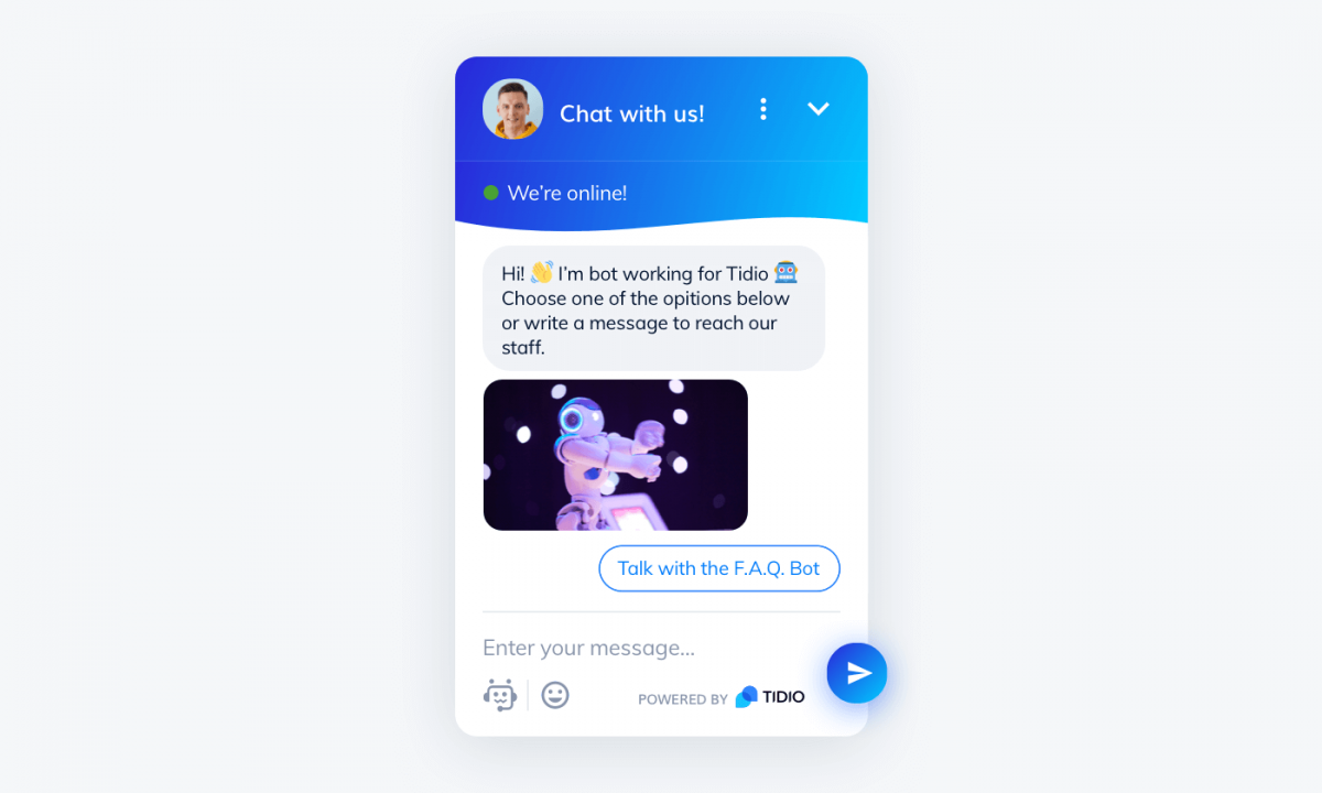
The sooner users know they are writing with a chatbot, the lower the chance for misunderstandings.
In the long run, there is really no point in hiding the fact that the messages are sent automatically. It will even work to your advantage—your visitors will know they can expect a quick response as soon as they type in their questions.
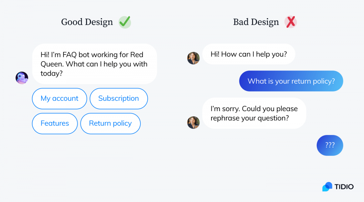
Compare this human impostor chatbot with a button-based chatbot conversation design:
8. Keep chatbot conversation flows simple and to the point
It is very easy to fall down the rabbit hole when you are working on your chatbot design.
You feel like you can anticipate every potential question and every way the conversation might unfold.
I know the thrill! But before you know it, it’s five in the morning and you’re preparing elaborate answers to totally random questions. You know, just in case users decide to ask the chatbot about its favorite color.
You’ll probably end up with something like this terrible chatbot design example:
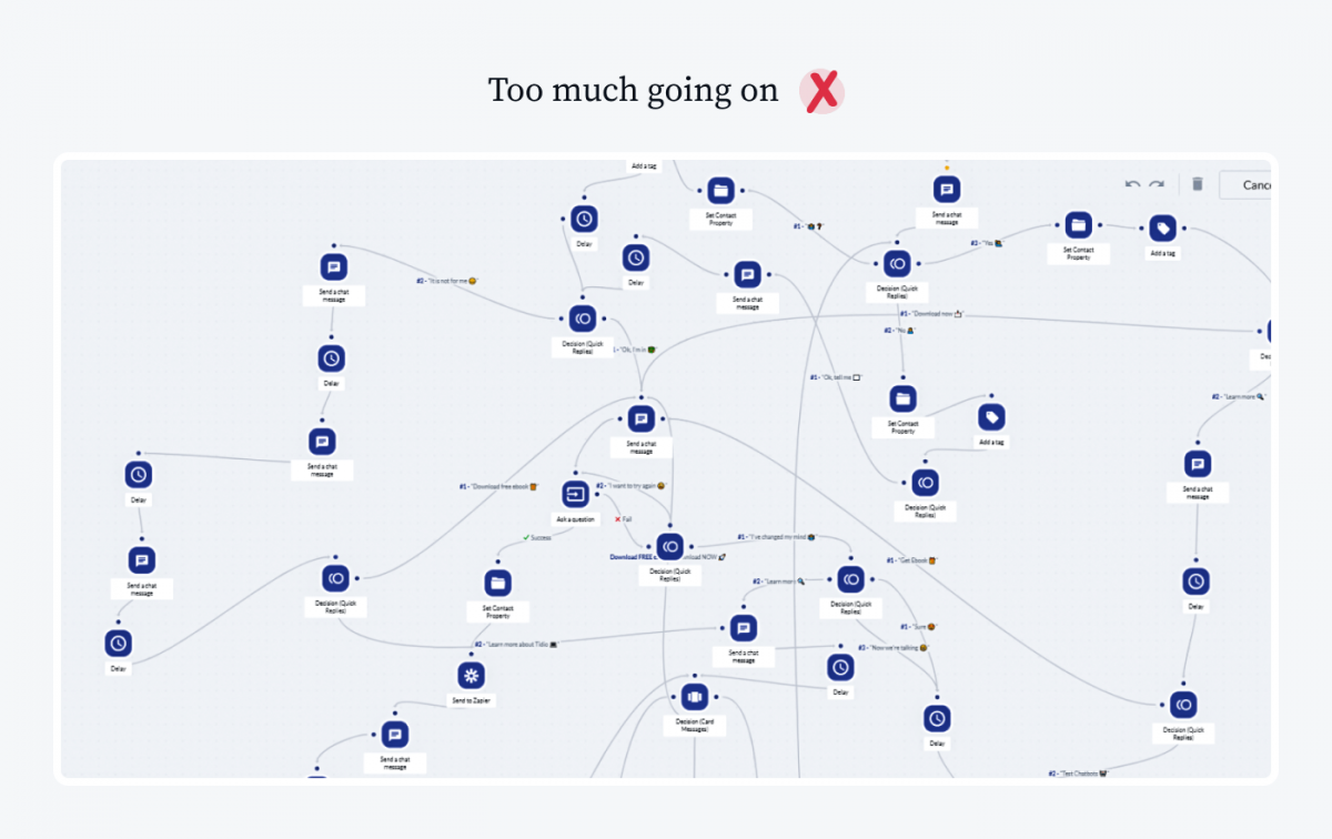
Zoom out and you’ll see that this is just a small fragment of an even bigger chatbot flow. This chatbot interaction design tries to cover too much ground.
You’re probably tempted to design a chatbot that would be able to entertain dinner guests and show off its knowledge of numerous topics. But ask yourself if it makes any business sense. And if your chatbot really needs to be that complex.
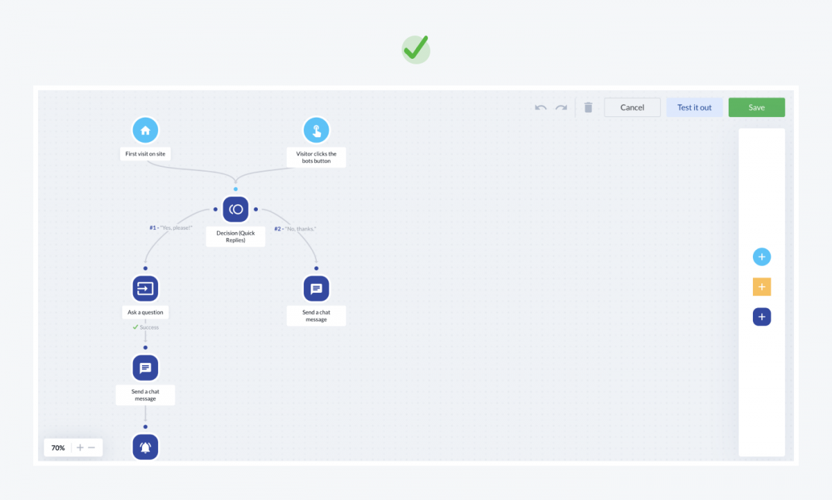
Try to map out the potential outcomes of the conversation and focus on those that overlap with the initial goals of your chatbot.
9. Use visuals for better effect
Most channels where you can use chatbots also allow you to send GIFs and images. Emojis and images are very popular in private conversations. If you want the conversations with your chatbot to have a similar, informal feel, consider decorating it with nice visuals.
You can use memes and GIFs just the same way you would during a chat with a friend. It can add more oomph to your messages. A nice image or video animation can make a joke land better or give a visual confirmation of certain actions. It creates great conversational experiences.
Here is an example:
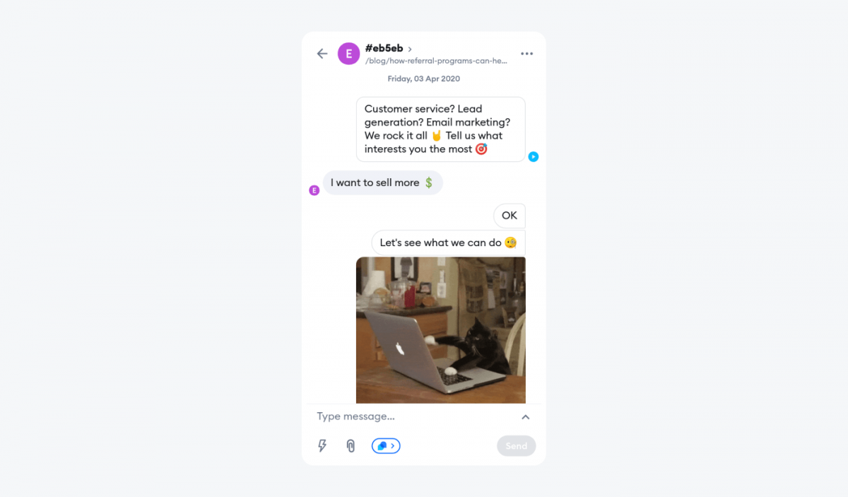
This chatbot uses emojis, animated GIFs, and it sends messages with a slight delay. This allows you to control exactly how the conversation with the user moves forward. The pacing and the visual hooks make customers more engaged and drawn into the exchange of messages.
Adding visual buttons and decision cards makes the interaction with your chatbot easier.
I have seen this mistake made over and over again; websites will have chatbots that are just plain text, with no graphical elements. It’s disengaging, and I didn’t know what the chatbot was trying to achieve. It is an absolute must to add in images, cards, and buttons, even where there normally wouldn’t be in a text conversation.
Tony Martins
Profitable Venture
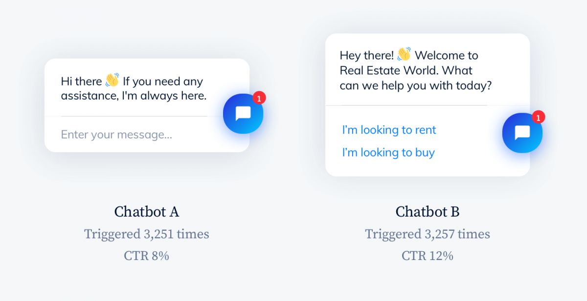
10. A/B test your chatbots to see which messages work
Play around with the messages and images used in your chatbots. It’s good to experiment and find out what type of message resonates with your website visitors.
You can use external tools like VWO or trigger two versions of your chatbot with Tidio Chatbot API. If you want to learn more about AB tests you may find these resources useful:
It is very easy to clone chatbot designs and make some slight adjustments. You can trigger custom chatbots in different versions and connect them with your Google Analytics account. It is also possible to create your own user tags and monitor performance of specific chatbot templates or custom chatbot designs.
It may turn out that a more aggressive approach can improve your engagement or sales. Here’s what Kevin Cook from On the Map discovered:
If the chat box overtakes the page after 10 seconds, you will see engagements shoot through the roof. It goes against everything we care about and is an annoyingly true statistic. It’s invasive and aggressive, but it really does work.
Kevin Cook
Chief Product Owner, On the Map Inc.
You can try out some of the following experiments and see what is more engaging to your visitors. You can A/B test chatbots:
- With or without an avatar
- With quick reply buttons or open-ended questions
- With benefit-oriented messages or messages that offer assistance
- That use pre-chat survey or ask for emails only during chats
11. Design a chatbot avatar that matches its personality
Designing chatbot personalities is extremely difficult when you have to do it with just a few short messages. That’s why chatbot avatars come in really handy.
A cool chatbot avatar is like the icing on the cake. It’s a nice touch that makes it more memorable and fun to interact with. When users see a character—even if it is just a cartoon dog or a robot—it is much easier to channel their emotions.
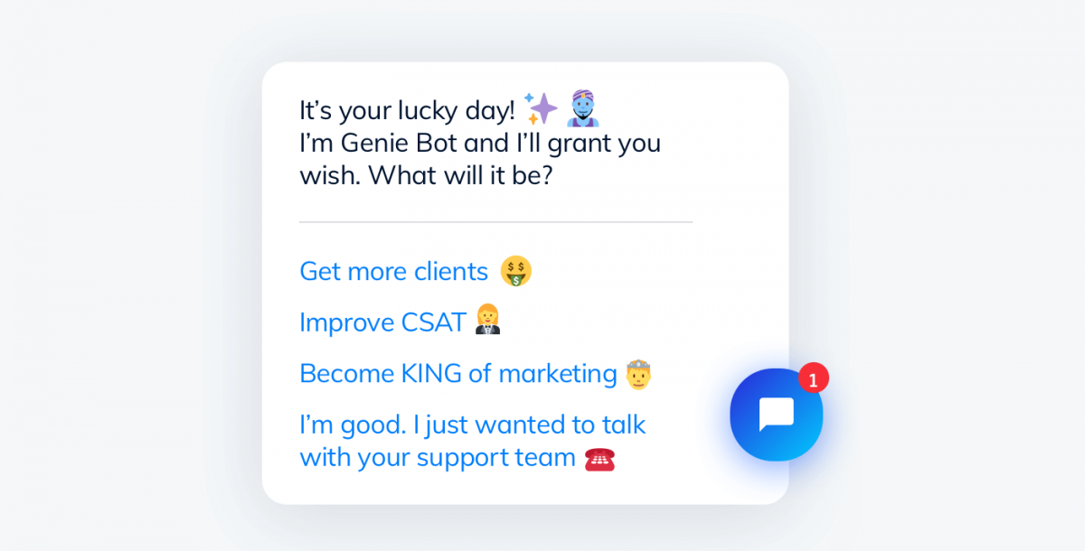
Still, you should be careful. If we use a chatbot instead of an impersonal and abstract interface, people will connect with it on a deeper level. It means that it will be easier to get angry at it too.
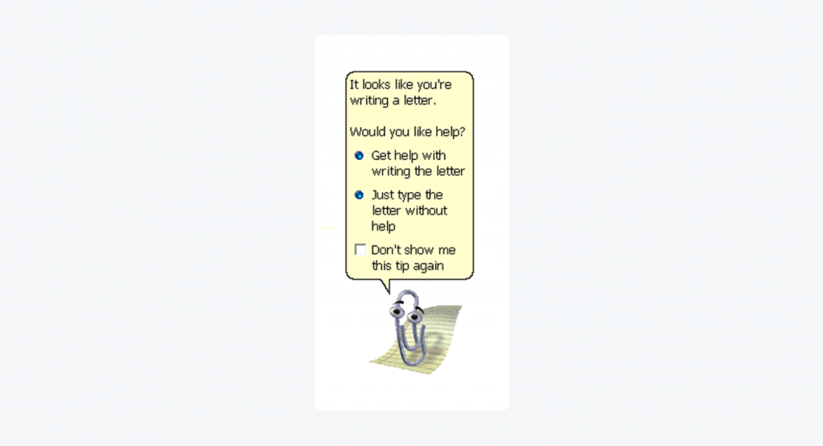
I have given a name to my pain, and it is Clippy…
Many people hated Clippy, the overly-helpful Microsoft Office virtual assistant. Let’s face it— working on documents can sometimes be a frustrating experience. When the tool dangled a mascot in front of them, it was adding insult to the injury. If you know that your chatbot will talk mostly with the users who are upset, a cute chatbot avatar won’t help. It may be better to use a solution that is more neutral and impersonal.
Here are several interesting examples of memorable chatbot avatar designs.
Chatbot avatar design examples:
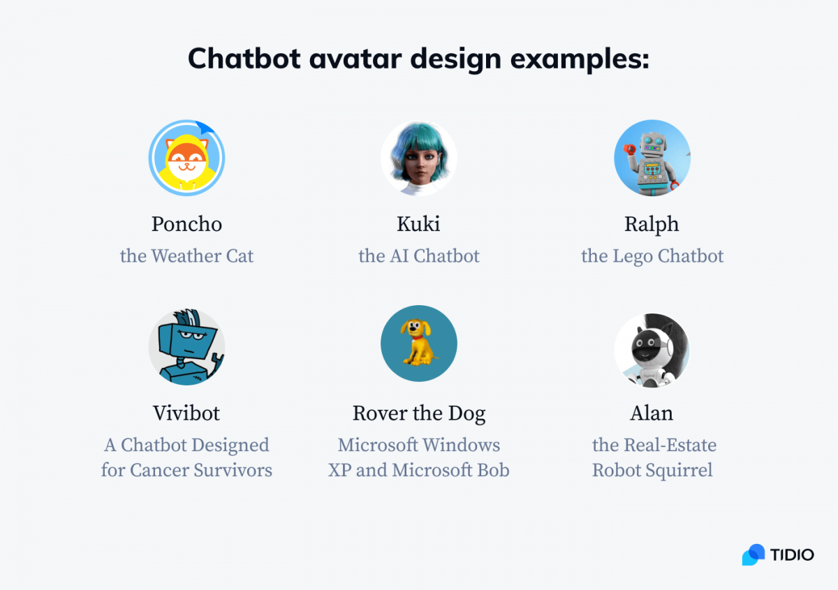
Some of them are robots, some are cute animals. Some are both.
Is it a robot squirrel? A squirrel robot?
In any case—
The horror. The horror.
The hard truth is that the best chatbots are the ones that are most useful. We usually don’t remember interacting with them because it was effortless and smooth.
How can this be?
Good design doesn’t draw attention to itself but makes the user experience better. It is perfectly acceptable that at times the best avatar for a chatbot is a neutral one. Or no avatar whatsoever. There are many great chatbot designs that don’t use anything resembling a face or a character.
If you want to check out more chatbots, read our article about the best chatbot examples.
12. Leave a possibility to contact a human support agent too
It is important to decide if something should be a chatbot and when it should not. That’s what the first tip was about. But it is also equally important to know when a chatbot should retreat and hand the conversation over.
What’s the worst-case scenario in chatbot design?
The user can’t get the right information from the chatbot despite numerous efforts. It is deeply frustrating and happens all too often.
It is perfectly OK for your chatbot to say: I’m sorry but I can’t help you. Would you like to contact a live chat agent?
Your chatbot, especially if it is one of your first projects, will need your help from time to time. But you can create a very smooth workflow for emergencies. You can set up mobile notifications that will pop up on your phone and allow you to take the conversation over in 10s.
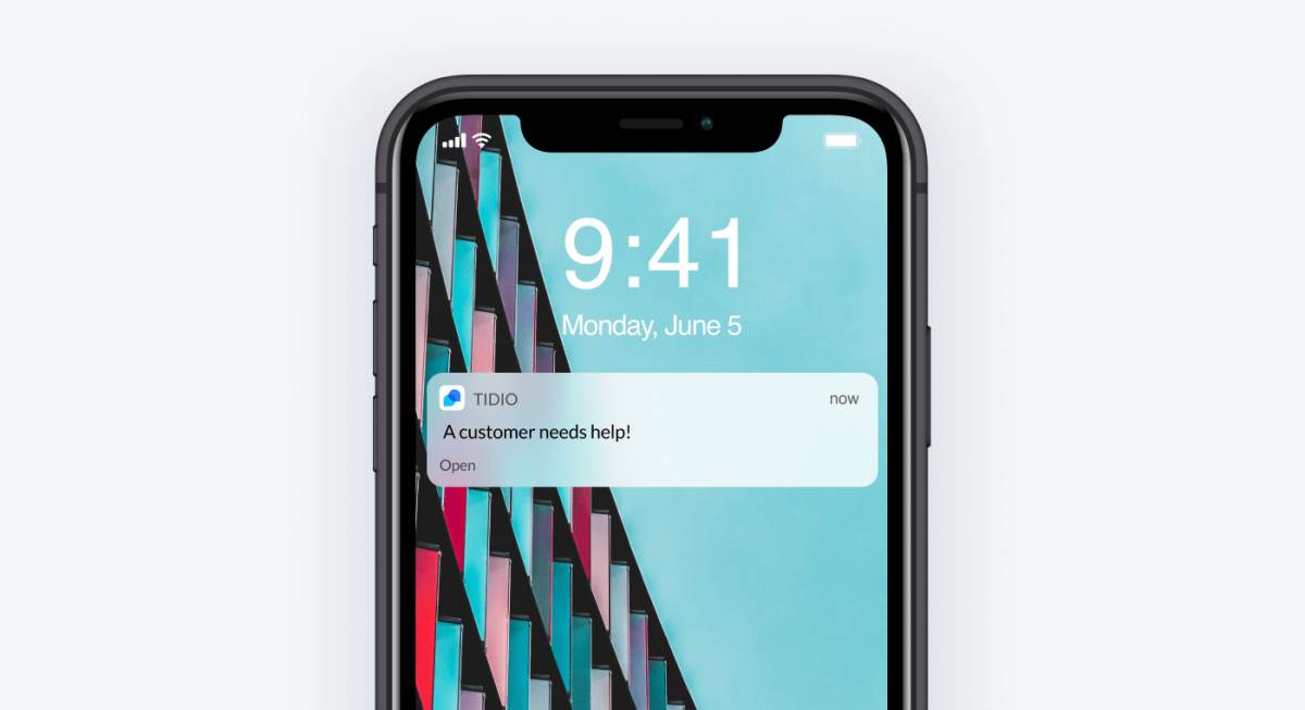
For many companies, chatbots work like digital speed bumps. Their primary goal is to keep visitors a little longer on a website and find out what they want.
We use our chatbot to filter visitors as a receptionist would do. Through the chatbot, we are able to determine whether a person really likes to chat with a live agent, or if they are only looking around.
Andrew Raso
Online Marketing Gurus
Read more: Check out the essential chatbot best practices to make your bot a success.
The Most Important Chatbot Design Principles: Summary
As soon as you start working on your own chatbot projects, you will discover many subtleties of designing bots. But the core rules from this article should be more than enough to start. They will allow you to avoid the many pitfalls of chatbot design and jump to the next level very quickly.
Here’s a quick recap of our chatbot design guidelines:
- Try to determine if the chatbot is the best way to solve a problem
- Consider the advantages of designing a bot over search bars, forms, or pop-ups in a given situation
- Choose an all-in-one platform that will allow you to modify chatbot templates, design new ones, and deploy chatbots in an easy way
- Select your objectives and don’t try to solve all of your problems at once
- Choose the right tone and voice for your chatbots
- Design a chatbot avatar that is pleasant to look at but does not steal the show
- Take care of potential chatbot interface issues such as message readability
- Don’t make your chatbots pretend that they are humans
- Keep your chatbot flows simple and organized
- Add visuals and emojis for more natural chatting experiences
- A/B test you chatbot designs and copy
- If you can, try to add an option to connect with a human agent
Are you ready to test them out straight away?

