Let’s acknowledge the elephant in the room—
Many customers try to talk to chatbots just like they would to a human. And, to be fair, it is an honest mistake. But usually, it turns into an underwhelming user experience.
Good news? There are some easy tricks to improve all interactions between your chatbots and their users. You can learn what works, what doesn’t work, and how to avoid common pitfalls of designing chatbot UI.
So, how do you create a chatbot interface that is effective and appealing to your users?
Let’s start by saying that the first chatbot was developed in 1966 by Joseph Weizenbaum, a computer scientist at the Massachusetts Institute of Technology (MIT).
Here’s a little comparison for you of the first chatbot UI and the present-day one.
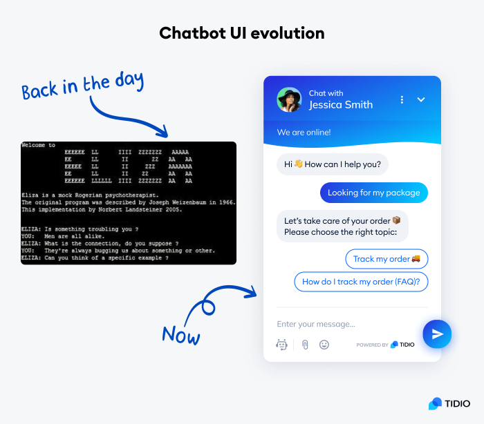
Nowadays, chatbot interfaces are more user-friendly than ever before. While they are still based on messages, there are many graphical components of modern chatbot user interfaces.
We’re also seeing the mass implementation of chatbots for business and customer support. In 2021, about 88% of web users chatted with chatbots, and most of them found the experience positive.
Here comes the main question—
What is chatbot UI?
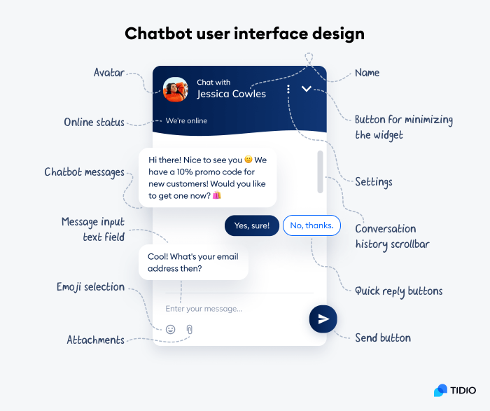
A chatbot user interface (UI) is part of a chatbot that users see and interact with. This can include anything from the text on a screen to the buttons and menus that are used to control a chatbot. The chatbot UI is what allows users to send messages and tell it what they want it to do.
Have a look at the following examples of two solutions that offer customer service via online widgets. One of them is a traditional knowledge base popup and the other uses a chatbot interface widget.
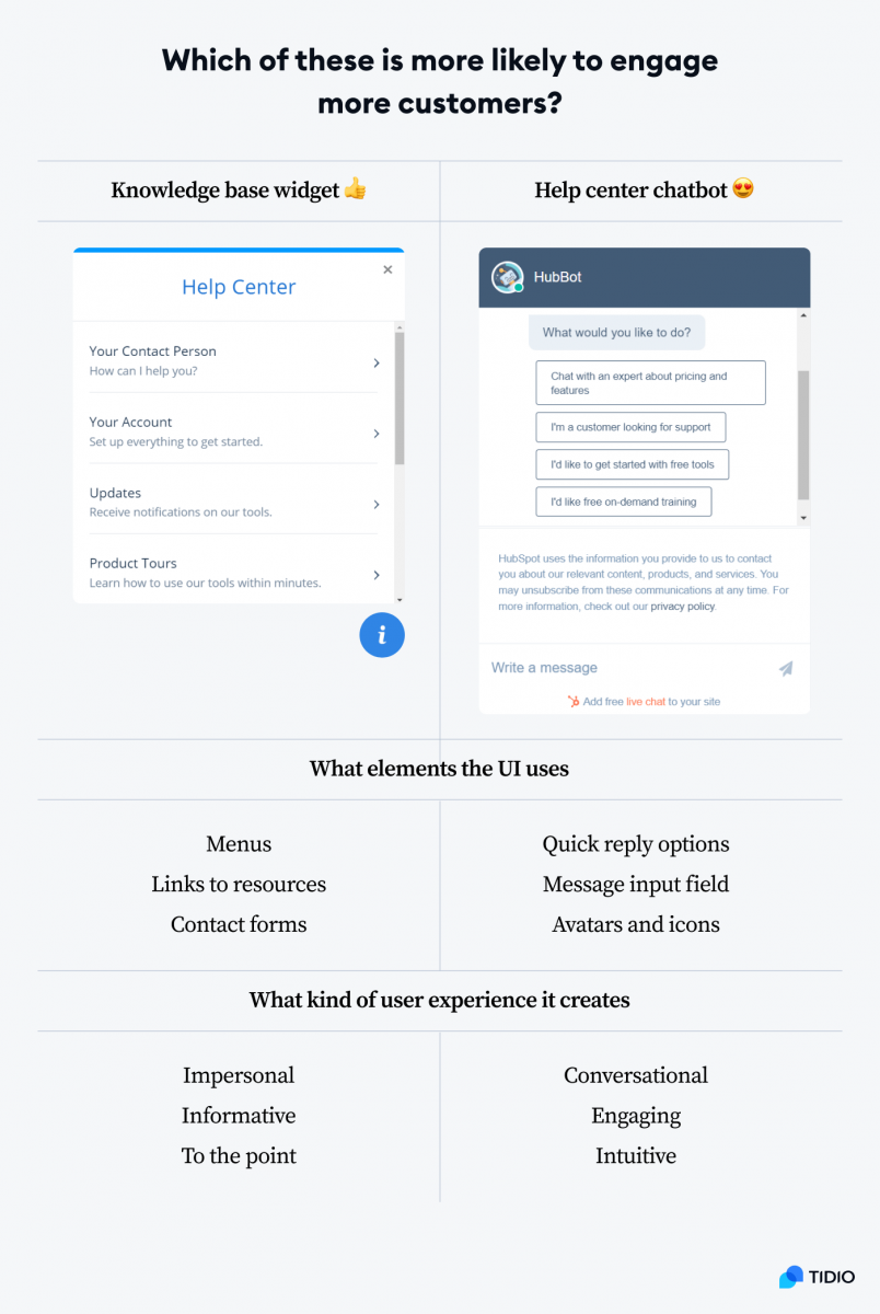
Instead of clicking through the menus you can just write a message and everything happens in the chat panel. It accomplishes the same goals but in a more user-friendly way.
If this is the case, should all websites and customer service help centers be replaced by chatbot interfaces? As a matter of fact, not everything is so clear-cut. And a good chatbot UI must meet a number of requirements to work to your advantage.
What makes great chatbot interfaces
A good chatbot UI should be easy to use and understand. It should also be visually appealing so that users enjoy interacting with it. From the perspective of business owners, the chatbot UI should also be customizable. It should be easy to change the way a chatbot looks and behaves. For example, changing the color of the chat icon to match the brand identity and website of a business is a must.
Good chatbot UIs:
- Are intuitive and self-explanatory
- Allow users to scroll through the chat history
- Help users make decisions by suggesting quick replies
- Facilitate clear and fast communication
- Seamlessly integrate with websites and platforms
- Use responsive design and work on all devices
Human-computer communication moved from command-line interfaces to graphical user interfaces, and voice interfaces. Chatbots are the next step that brings together the best features of all the other types of user interfaces. All of this ultimately contributes to delivering a better user experience (UX).
What is the difference between chatbot UI and chatbot UX?
Chatbot UI and chatbot UX are connected, but they are not the same thing. The UI (user interface) of a chatbot refers to the design and layout of the chatbot software interface. The UX (user experience) refers to how users interact with the chatbot and how they perceive it.
In a nutshell, designing a big red button is a UI consideration. But whether pressing it feels good or not is a matter of UX. Chatbot interface design refers to the form, while chatbot user experience is based on subjective impressions of end-users.
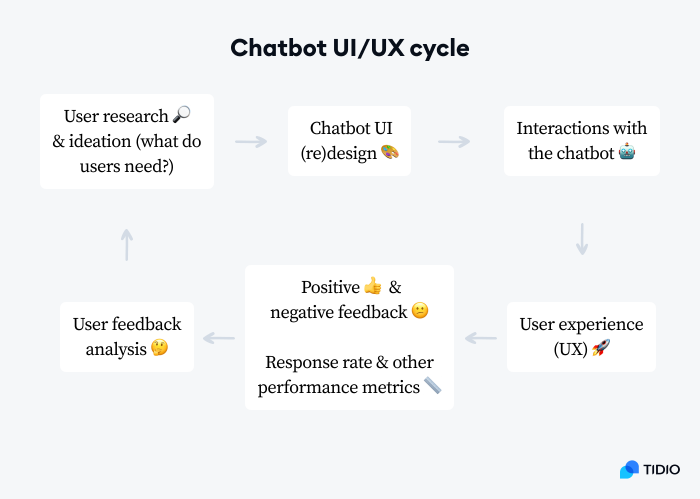
If the UI is confusing or difficult to use, users will not be able to communicate with the chatbot effectively. The UI determines how users feel when they are using the chatbot. It directly translates into a positive or negative user experience.
That’s why it is essential to collect feedback from your users.
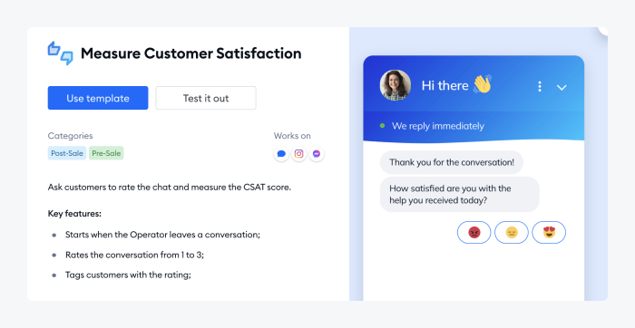
In most cases, you can collect customer feedback automatically. Here is an example of a chatbot UI that lets you trigger a customer satisfaction survey in the regular conversation panel.
Best chatbot UI examples
Chatbot UI designers are in high demand as companies compete to create the best user experience for their customers. The stakes are high because implementing good conversational marketing can be the difference between acquiring and losing a customer. On average, $1 invested in UX brings $100 in return—and UI is where UX starts.
Well-designed user interfaces can significantly raise conversion rates. And more than 36% of online businesses believe that conversational interfaces provide more human and authentic experiences.
Let’s explore some of the best chatbot UI examples currently in use.
1. Tidio
Tidio is a live chat and chatbot combo that allows you to connect with your website visitors and provide them with real-time assistance. It’s a powerful tool that can help create your own chatbots from scratch. Or, if you feel lazy, you can just use one of the templates with pre-written chatbot scripts.
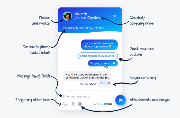
The single best advantage of this chatbot interface is that it’s highly customizable. You can modify almost everything, from chatbot icons to welcome messages. Moreover, you can upload your own graphics to enhance user interaction. Find them on visual assets sites like Icons8, offering everything from profile icons to personalize your chatbot to start symbols to rate the conversation quality.
Actually, there is one thing that may be even better. This chatbot builder is free. And some of the functionalities available in the app will not only help you change elements of the interface, but also measure if the changes worked.
2. Kuki AI
Kuki, also known as Mitsuku, is an artificial intelligence chatbot developed by Steve Worswick. It won the Loebner Prize several times and is considered by some to be the most human-like chatbot in existence.
Kuki has something of a cult following in the online community of tech enthusiasts. The interface is extremely simple and minimalistic. No topics or questions are suggested to the user and open-ended messages are the only means of communication here. It makes sense when you realize that the sole purpose of this bot is to demonstrate the capabilities of its AI.
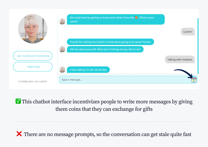
However, relying on such a chatbot interface in business situations can be problematic. If the UI doesn’t clearly communicate what the chatbot can do, people will start playing with it. And all users fall into several, surprisingly predictive, categories.
Kuki’s creator, Steve Worswick says that there are three types of people chatting with the bot. The first group just writes abusive and sex-related messages. The second group of users pretends that they are chatting with an actual person and try to carry out a regular conversation. The last type tries to test the chatbot UI and its AI engine.
They’re usually highly educated and intelligent people who just like to trip it up. They’ll ask nonsense questions like, “Can you eat a cinema?” (…) Nobody talks like that. If I was to go up to some of you guys at a party and before I’ve even said hello, I said, “How many syllables are in banana?” you’d think I was an idiot, wouldn’t you, and it’s the same with this.
3. Landbot
If you’re looking for a platform to create landing pages for conversational marketing, then Landbot is a good choice. You can build a chatbot and deploy it as a separate landing page or incorporate your bot anywhere on your website. It’s easy to use and doesn’t require any programming knowledge. You can create a chatbot in minutes, without any prior experience. To make the task even easier, it uses a visual chatbot editor.
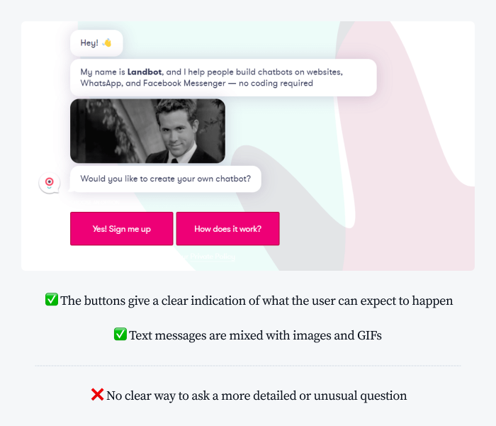
This chatbot interface presents a very different philosophy than Kuki. Its users are prompted to select buttons Instead of typing messages themselves. They cannot send custom messages until they are explicitly told to. The flow of these chatbots is predetermined, and users can leave contact information or feedback only at very specific moments.
Here is a real example of a chatbot interface powered by Landbot. The chat panel of this bot is integrated into the layout of the website. As you can see, the styling of elements such as background colors, chatbot icons, or fonts is customizable.
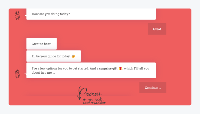
The ability to incorporate a chatbot anywhere on the site or create a separate chat page is tempting. However, Landbot can also be used as a regular popup widget.
Read more: Best Business Chatbot Use Cases
4. Replika
Replika is an AI app that lets you create a virtual friend or a personal assistant. It’s designed to be a true digital companion. And unlike other chatbots that simply provide pre-programmed responses, Replika’s AI engine is constantly learning and evolving, meaning that it can have more in-depth and meaningful conversations the more you chat with it.
Replika’s UI is very interesting. It’s not just a chat window—it also includes an augmented reality mode. The 3D avatar of your virtual companion can appear right in your room. It switches to voice mode and feels like a regular video call on your phone.
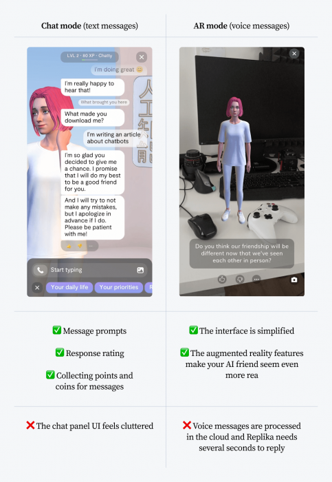
Replika is available for iOS and Android and you can download it for free. There is also a premium subscription available that gives you access to additional features.
5. Wysa
Wysa is a self-care chatbot that was designed to help people with their mental health. It is meant to provide a simple way to improve your general mood and well-being.
The chatbot is based on cognitive-behavioral therapy (CBT) which is believed to be quite effective in treating anxiety. Wysa also offers other features such as a mood tracker and relaxation exercises.
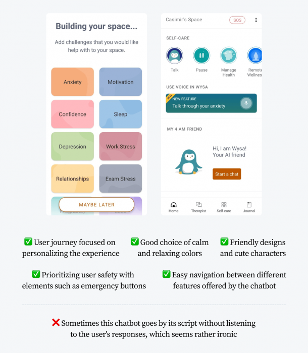
This chatbot interface seems to be designed for a very specific user persona in mind. Its creators recognize their user base, understand customer needs, and address pain points of their users. Wysa uses soft and pastel colors, a friendly therapist penguin avatar, and many extra tools for managing your mental wellbeing.
6. Drift
Drift is an advanced tool for generating leads, automating customer service, and chatbot marketing. It’s one of many chatbot interface examples that rely heavily on quick reply buttons. It also offers many customizable avatars. You can create your own cute bot if you think your customers are digging this chatbot design style.
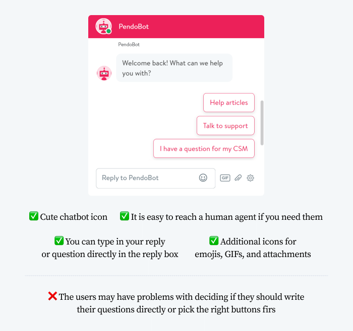
Customer support teams who want to provide a better experience for their customers often use Drift as a help center widget similar to the example mentioned at the very beginning of our article. Incidentally, that was a chatbot powered by HubSpot, not Drift. But the majority of these solutions can be used interchangeably and are just a matter of personal preferences.
Read more: Best Drift Alternatives
7. WHO chatbot
World Health Organization created a chatbot to fight the spread of misinformation and fake news related to the COVID-19 pandemic. For example, you can take a quiz to test your knowledge and check current infection statistics.
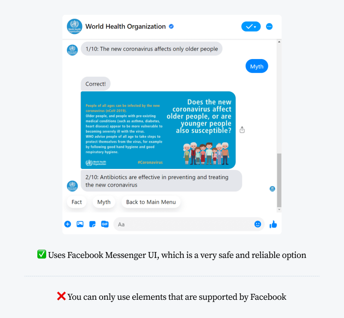
This is one of the most popular active Facebook Messenger chatbots. Still, using this social media platform for designing chatbots is both a blessing and a curse. We can write our own queries, but the chatbot will not help us. This means that the input field is only used to collect feedback. In reality, the whole chatbot only uses pre-defined buttons for interacting with its users.
You don’t have to create bots exclusively for messaging apps. You can use a multichannel chatbot software and integrate it with your Facebook, WhatsApp, Instagram, Slack, or even email automation apps. This significantly reduces the amount of work you need to put into developing your chatbots.
How to customize chatbot interface
If you want to add a chatbot interface to your website, you may be interested in using a WordPress chatbot or Shopify chatbot with customizable user interfaces. In fact, you can add a live chat on any website and turn it into a chatbot-operated interface.
To customize the look and feel of your chatbot interface:
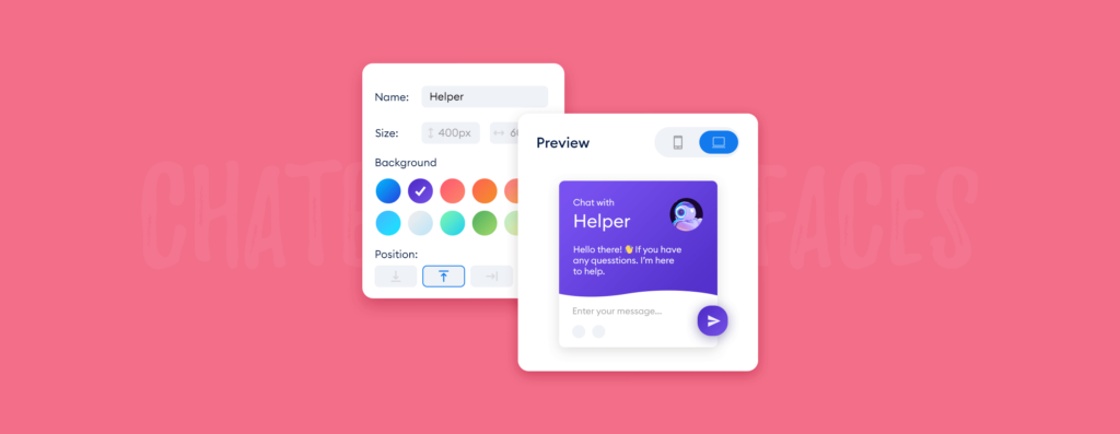
You can now change the appearance and behavior of your chatbot widget. Additionally, you will be able to get a preview of the changes you make and see what the interface looks like before deploying it live.
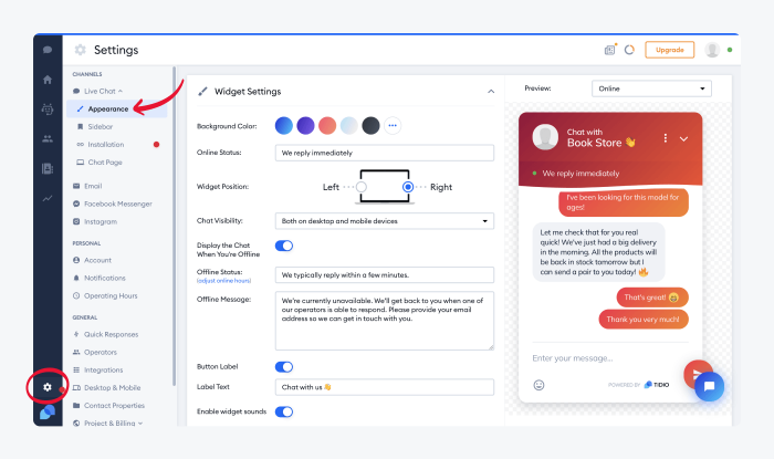
No matter what adjustments you make, it is a good idea to review the best practices for building functional UIs for chatbots.
Principles of chatbot UI design
Take a quick glance at the two chatbot UI examples below. Can you tell which one of them contributes to improving the quality of customer experience?
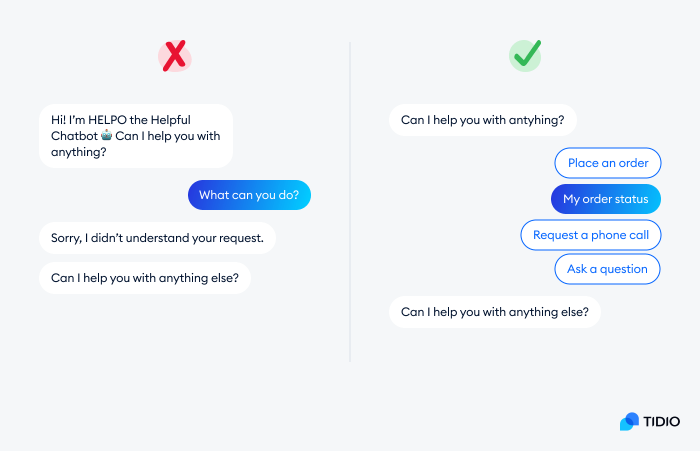
While the first chatbot earns some extra points for personality, its usability leaves much to be desired. It is the second example that shows how a chatbot interface can be used in an effective and convenient way.
Chatbot UIs should be:
- Easy to use. The best chatbot UIs are designed with the user in mind, and they make it easy for users to access the features or information they need.
- Responsive. Creating a consistent experience across all devices is an important aspect of chatbot UI/UX design.
- Engaging. Consider your microcopy, UI labels, and messages to increase response rates and optimize your bots.
- Convenient. Your chatbot should help people get information more quickly or provide a more personalized experience for users.
- Endowed with personality. People prefer to interact with other humans or human-like virtual beings.
- Flexible. Chatbots should be able to respond to any kind of query, or at the very least ensure they will pass the message on.
Here are some dos and don’ts of conversational UI design:
| What to keep in mind | Avoid |
|---|---|
| ✅ Decide what kind of information your chatbot will collect from users. This will help you determine what kind of UI elements you’ll need to include in your chatbot. | 🚫 Too many messages or too much information in the chatbot’s initial greeting. This can overwhelm the user. |
| ✅ Think ahead about how users will interact with your chatbot. Will they be typing in questions or commands? Or will they be clicking on buttons or menus? | 🚫 Relying on user input messages without clear prompts, buttons, and instructions. It makes chatbots confusing and difficult to use. |
| ✅ Test your chatbot UI with real users before you launch it. This will help you detect bugs or usability issues that you didn’t anticipate. | 🚫 Chatbot conversation flows that are too complex and try to solve too many problems all at once. |
Some of these issues can be covered instantly if you choose the right chatbot software. They offer out-of-the-box chatbot templates that can be added to your website or social media in a matter of minutes. You can customize chatbot decision trees and edit user flows with a visual builder.
Read more: Learn the important chatbot best practices for an effective implementation.
How do you make a chatbot UI from scratch?
If you are interested in designing chatbot UI from scratch, you should use a UI mockup tool such as Figma, MockFlow, or Zeplin. Just remember that your chatbot will still need an AI engine or a bot framework.
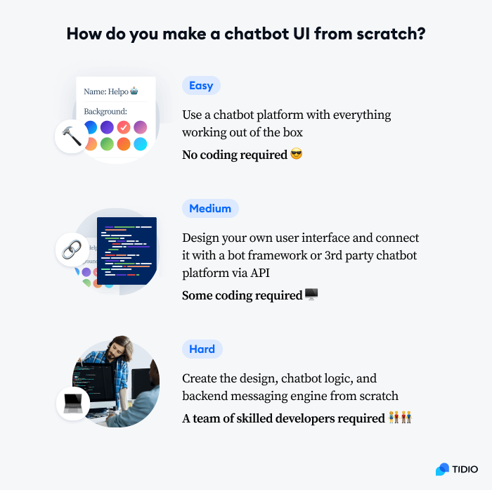
Coding everything by yourself can be extremely challenging. In the end, it may still be simpler to design the visual elements of the interface and connect it with a third-party chatbot engine via Tidio JavaScript API.
Conclusion
Creating a chatbot UI is not that different from designing any other kind of user interface. The main challenge lies in making the chatbot interface easy to use and engaging at the same time. However, by following the guidelines and best practices outlined in this article, you should be able to create a chatbot UI that provides an excellent user experience.
If you think that you want to try out chatbot design, but you’re not sure where to start, consider using chatbot software that offers customizable templates. This will give you a head start on creating your own chatbot UI without having to start from scratch.
